Revolutionizing Business Intelligence: The Power of Data Visualization Tools
In today’s data-driven business landscape, making sense of the vast amounts of information at our fingertips can be overwhelming.
SORT
Learn why SEO Testing Tools is free?
SEO Testing Tools is free for users because vendors pay us when they receive web traffic and sales opportunities.
SEO Testing Tools directories list all vendors—not just those that pay us—so that you can make the best-informed purchase decision possible.
375.32K reviews
275.92K followers
- 41.19K users like this
- This launch happened 18 years ago
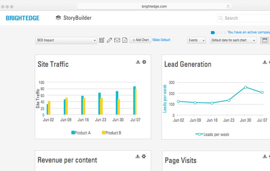
BrightEdge offers powerful SEO insights, content optimization, and competitive analysis. Its real-time data boosts organic traffic, enhances visibility, and drives effective marketing strategies.
LICENSE MODEL
Paid
PRODUCT MODEL
Proprietary
PLATFORMS
- Online
- Software as a Service (SaaS)
BrightEdge CATEGORIES ON SEOTESTINGTOOLS.COM
BrightEdge FEATURES
- Keyword Research
- Keyword-tool
- SEO Audit
- SEO Reports
- Content analysis
- Website Audit
38.73K reviews
141.27K followers
- 198.77K users like this
- This launch happened 13 years ago
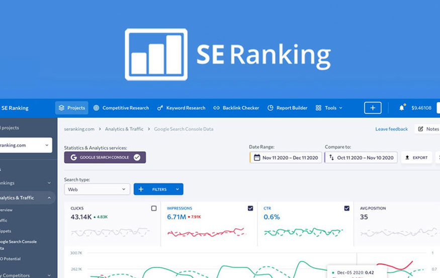
SE Ranking offers comprehensive SEO tools, including keyword tracking, competitive analysis, and website auditing. Its user-friendly interface and real-time updates empower businesses to enhance their online visibility effectively.
LICENSE MODEL
Free
PRODUCT MODEL
Open Source
PLATFORMS
- Online
- Android
- iOS
SE Ranking CATEGORIES ON SEOTESTINGTOOLS.COM
SE Ranking FEATURES
- Website Monitoring
- Rank Tracking
- SEO Reports
- SEO Audit
- Ranking monitoring
- Keyword-tool
- Backlinks Analysis
- Competitor Monitoring
- Website ranking
- White-labeled
73.76K reviews
339.92K followers
- 32.93K users like this
- This launch happened an unknown year
Taja leverages artificial intelligence to enhance YouTube video discoverability. This tool automatically creates search engine optimized content, including titles, descriptions, chapter markers, and hashtags for your YouTube uploads.
LICENSE MODEL
Paid
PRODUCT MODEL
Proprietary
PLATFORMS
- Online
Taja AI CATEGORIES ON SEOTESTINGTOOLS.COM
Taja AI FEATURES
- Ad-free
- Lightweight
- Privacy focused
- No Coding Required
- Copywriting
180.74K reviews
237.19K followers
- 92.37K users like this
- This launch happened 2 years ago
Blogster AI streamlines content creation with AI-driven writing, SEO optimization, and topic generation. It enhances productivity, boosts engagement, and ensures quality, making blogging effortless.
LICENSE MODEL
Freemium
PRODUCT MODEL
Proprietary
PLATFORMS
- Online
Blogster AI CATEGORIES ON SEOTESTINGTOOLS.COM
Blogster AI FEATURES
- Live Preview
- No Coding Required
- Marketing Automation
- Privacy focused
- SEO Audit
- AI-Powered
85.94K reviews
266.48K followers
- 244.45K users like this
- This launch happened 11 years ago
Sitechecker offers comprehensive SEO auditing, rank tracking, and website monitoring tools. It enhances site visibility, identifies issues, and provides actionable insights to boost search rankings effectively.
LICENSE MODEL
Freemium
PRODUCT MODEL
Proprietary
PLATFORMS
- Online
- Software as a Service (SaaS)
- Self-Hosted
- Google Chrome
Sitechecker CATEGORIES ON SEOTESTINGTOOLS.COM
Sitechecker FEATURES
- Crawler
- SEO Audit
- SEO Reports
157.65K reviews
335.11K followers
- 97.83K users like this
- This launch happened 18 years ago
AIOSEO offers automated optimization with user-friendly settings, advanced schema integration, and powerful keyword analysis, enhancing your site’s visibility and boosting organic traffic effortlessly.
LICENSE MODEL
Paid
PRODUCT MODEL
Proprietary
PLATFORMS
- Online
AIOSEO CATEGORIES ON SEOTESTINGTOOLS.COM
AIOSEO FEATURES
- Backlinks
- Social media integration
- SEO Audit
275.09K reviews
381.63K followers
- 35.96K users like this
- This launch happened 17 years ago
Semrush offers robust tools for SEO, PPC, content marketing, and social media analytics. Its competitive analysis, keyword research, and site audit features help enhance visibility and drive traffic effectively.
LICENSE MODEL
Paid
PRODUCT MODEL
Proprietary
PLATFORMS
- Online
- Software as a Service (SaaS)
Semrush CATEGORIES ON SEOTESTINGTOOLS.COM
Semrush FEATURES
- Keyword Research
- Keyword-tool
- SEO Audit
- Backlinks Analysis
- Backlink checker
- Competitive Analysis
- Website Audit
- URL analysis
Top Business & Commerce apps of the week
Learn More About Business & Commerce
Table of Contents
Revolutionizing Business Intelligence: The Power of Data Visualization Tools
In today’s data-driven business landscape, making sense of the vast amounts of information at our fingertips can be overwhelming. That’s where data visualization tools come in, transforming raw numbers into compelling visual stories that drive decision-making. As a seasoned tech consultant who’s implemented countless software solutions across industries, I’ve seen firsthand how these tools can revolutionize business intelligence. Let’s dive into the world of data visualization and explore how it’s reshaping the way we understand and leverage our data.
Understanding Data Visualization in the Modern Enterprise
Before we delve into the nitty-gritty of data visualization tools, let’s take a step back and consider the bigger picture. Why has data visualization become such a hot topic in recent years?
The Evolution of Business Intelligence
Remember the days when business intelligence meant poring over spreadsheets and static reports? I sure do, and let me tell you, it wasn’t pretty. We’ve come a long way since then. The evolution of business intelligence has been nothing short of remarkable, moving from basic reporting to advanced analytics and now to intuitive visual representations of data.
This shift hasn’t happened in a vacuum. It’s been driven by the exponential growth in data volumes and the increasing complexity of business operations. As the saying goes, “A picture is worth a thousand words,” and in the case of data visualization, it might be worth a million data points!
Key Benefits of Data Visualization
So, what makes data visualization so powerful? Here are some of the key benefits I’ve observed:
- Faster insights: Visual representations allow us to grasp complex information quickly.
- Improved decision-making: When data is presented visually, patterns and trends become more apparent, leading to better-informed decisions.
- Enhanced communication: Visuals make it easier to share insights across teams and departments.
- Increased engagement: Let’s face it, colorful charts and interactive dashboards are far more engaging than rows of numbers.
- Data democratization: Visual tools make data accessible to non-technical users, fostering a data-driven culture throughout the organization.
Top Data Visualization Tools for Enterprise Use
Now that we understand the importance of data visualization, let’s look at some of the top tools available for enterprise use. I’ve implemented and worked with numerous solutions over the years, but these three consistently stand out:
Tableau: The Industry Standard
Tableau has long been considered the gold standard in data visualization, and for good reason. Its intuitive interface and powerful features make it a favorite among both data analysts and business users.
What I love about Tableau is its flexibility. Whether you’re creating a simple bar chart or a complex interactive dashboard, Tableau has you covered. It also excels at handling large datasets, which is crucial for enterprise-level applications.
One of Tableau’s standout features is its ability to connect to a wide range of data sources, from Excel spreadsheets to cloud-based databases. This versatility makes it an excellent choice for organizations with diverse data ecosystems.
Power BI: Microsoft’s Powerhouse
If your organization is already heavily invested in the Microsoft ecosystem, Power BI is a natural choice. It integrates seamlessly with other Microsoft products and offers a familiar interface for users accustomed to tools like Excel.
Don’t let its Microsoft pedigree fool you, though. Power BI is a robust tool in its own right, capable of creating stunning visualizations and handling complex data models. Its AI-powered features, such as natural language querying, are particularly impressive and can help democratize data analysis within your organization.
QlikView: Associative Analytics
QlikView takes a slightly different approach to data visualization with its associative model. This unique feature allows users to explore relationships between data points that might not be immediately obvious in traditional BI tools.
While QlikView has a steeper learning curve than some of its competitors, I’ve found that it can be incredibly powerful in the hands of skilled analysts. Its in-memory processing engine also ensures snappy performance, even when dealing with large datasets.
Implementing Data Visualization in Your Organization
Choosing the right data visualization tool is just the first step. Successfully implementing it across your organization requires careful planning and execution. Here’s a roadmap I typically follow when helping clients adopt data visualization tools:
Assessing Your Data Visualization Needs
Before diving into tool selection, it’s crucial to understand your organization’s specific needs. Ask yourself:
- What types of data do we need to visualize?
- Who will be using the visualizations?
- What level of technical expertise do our users have?
- What are our key performance indicators (KPIs)?
By answering these questions, you’ll be better equipped to choose a tool that aligns with your organization’s goals and capabilities.
Choosing the Right Tool
With your needs assessment in hand, it’s time to evaluate different data visualization tools. While we’ve covered three popular options earlier, there are many others on the market worth considering.
Considering User Experience
Remember, the most powerful tool in the world is useless if your team can’t or won’t use it. Look for solutions with intuitive interfaces and robust training resources. Consider arranging demos or trials to get hands-on experience before making a decision.
Scalability and Integration
Think long-term when selecting a tool. Will it be able to handle your data volumes as they grow? Can it integrate with your existing systems and data sources? These factors are crucial for ensuring a smooth implementation and avoiding costly migrations down the line.
Training and Adoption Strategies
Once you’ve selected a tool, the real work begins. Successful adoption requires a comprehensive training program and ongoing support. Here are some strategies I’ve found effective:
- Start with a pilot group to iron out any kinks before rolling out company-wide.
- Offer a mix of formal training sessions and self-paced learning resources.
- Identify “power users” who can act as internal champions and provide peer support.
- Create a library of standard visualizations and dashboards to give users a starting point.
- Regularly showcase successful use cases to demonstrate the tool’s value and inspire adoption.
Future Trends in Data Visualization
As with any technology, the field of data visualization is constantly evolving. Here are some exciting trends I’m keeping an eye on:
AI-Powered Insights
Artificial intelligence is already making its way into data visualization tools, with features like automated insights and natural language processing. In the future, we can expect AI to play an even bigger role, perhaps even generating entire dashboards based on verbal requests.
Augmented and Virtual Reality Visualizations
Imagine stepping inside your data, literally. Augmented and virtual reality technologies have the potential to transform how we interact with and understand complex datasets. While still in its early stages, this technology could revolutionize fields like scientific research and urban planning.
As we look to the future, one thing is clear: data visualization will continue to play a crucial role in helping businesses make sense of their ever-growing data. By embracing these tools and staying ahead of emerging trends, organizations can gain a significant competitive advantage in our data-driven world.
Conclusion
Data visualization tools have transformed the way businesses interact with and understand their data. From faster insights to improved decision-making and increased engagement, the benefits are clear. By carefully assessing your needs, choosing the right tool, and implementing effective training and adoption strategies, you can harness the power of data visualization to drive your organization forward.
Remember, the goal of data visualization isn’t just to create pretty pictures – it’s to tell compelling stories with your data that inspire action and drive results. So, are you ready to paint your data story?
FAQs
-
What’s the difference between data visualization and data analytics?
Data visualization focuses on presenting data in visual formats, while data analytics involves the broader process of examining, cleaning, transforming, and modeling data to discover useful information. -
How often should we update our data visualizations?
The frequency of updates depends on your data sources and business needs. Real-time dashboards might update continuously, while strategic visualizations might be refreshed weekly or monthly. -
Can data visualization tools handle unstructured data?
Many modern data visualization tools can work with unstructured data, but they may require additional processing or integration with other tools to extract meaningful insights. -
Is it necessary to have a dedicated data analyst to use these tools?
While having a data analyst can be beneficial, many data visualization tools are designed to be user-friendly for non-technical users. With proper training, business users can often create their own visualizations. -
How can we ensure data security when using cloud-based visualization tools?
Look for tools that offer robust security features like encryption, access controls, and compliance certifications. Always follow best practices for data governance and regularly audit your security measures.


